If you run a self-hosted WordPress blog, you must know JetPack and all the boatload of features it provides. Among them, it has a social sharing feature that lets you insert buttons to your posts and pages so your visitors can share your articles to different networks.
One of the few drawbacks in this feature is the lack of customization options to style your buttons. It can use the original buttons from the networks, which is nice, but it only provides other option that looks a little outdated.
I just finished styling my sharing buttons and I will let you know how to do it so they look like this, for example:
Installing JetPack
If you don’t have JetPack installed you can do it in the Plugins section of your WordPress admin panel. Click the Add New button, use the search function, look for JetPack and install it. Once installed you can access the configuration page in a new entry located on top of the admin panel options menu.
Enabling the Sharing Module
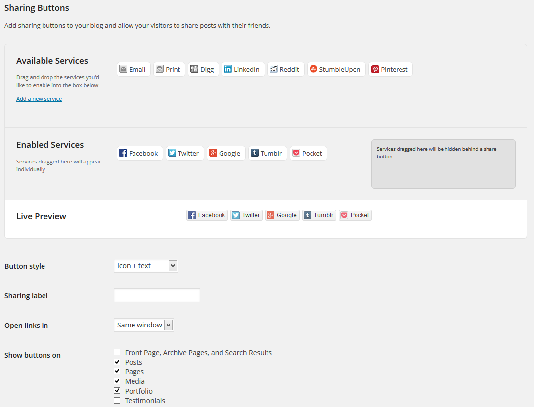
You can take your time to read about all the features JatPack has and enable the ones you want to use. For the social buttons, enable the Sharing module. It will add an option entry to Settings – Sharing on the admin panel menu. Go to that option and select the buttons you want to display and choose where you want to display them on your site.
Enabling the Custom CSS Module
To be able to style the social buttons we need to use CSS to apply custom properties. The easiest way to doing that is to use the Custom CSS module of JetPack which lets you apply custom CSS styles to your site without touching your theme’s CSS. This is important because if the theme doesn’t provide its own custom CSS module you will loose all your modified styles when updating the theme.
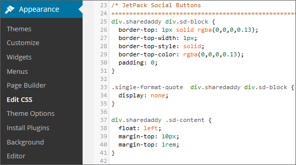
After enabling the Custom CSS Module it will add the entry Appearance – Edit CSS to the admin panel menu so you can access it easily.
Customizing Buttons Style via CSS
To apply a custom style to the buttons so they look like the ones on display at my site you can copy and paste the following CSS code using the Edit CSS option in the Appearance menu.
[css]/* JetPack Social Buttons */
div.sharedaddy div.sd-block {
border-top: 1px solid rgba(0,0,0,0.13);
border-top-width: 1px;
border-top-style: solid;
border-top-color: rgba(0,0,0,0.13);
padding: 0;
}
.single-format-quote div.sharedaddy div.sd-block {
display: none;
}
div.sharedaddy .sd-content {
float: left;
margin-top: 10px;
margin-top: 1rem;
}
div.sharedaddy a.sd-button {
border: none !important;
box-shadow: none;
}
.sd-social-icon-text a.sd-button > span, a.sd-button > span {
opacity: 1;
padding: 4px 10px;
padding: .4rem 1rem;
}
li.share-facebook a.sd-button > span,
li.share-google-plus-1 a.sd-button > span,
li.share-tumblr a.sd-button > span,
li.share-pinterest a.sd-button > span,
li.share-twitter a.sd-button > span,
li.share-pocket a.sd-button > span {
border: none;
color: #fff;
font-family: ‘verdana’, arial;
font-size: 6px;
font-size: .6rem;
font-weight: 300;
letter-spacing: 0;
text-transform: uppercase;
}
li.share-facebook a.sd-button > span {
background: #4965a0;
}
li.share-facebook a.sd-button:hover > span {
background: #1e73be;
}
li.share-twitter a.sd-button > span {
background: #55ACEE;
}
li.share-twitter a.sd-button:hover > span {
background: #1e73be;
}
li.share-google-plus-1 a.sd-button > span {
background: #dd4b39;
}
li.share-google-plus-1 a.sd-button:hover > span {
background: #1e73be;
}
li.share-tumblr a.sd-button > span {
background: #35465D;
}
li.share-tumblr a.sd-button:hover > span {
background: #1e73be;
}
li.share-pocket a.sd-button > span {
background: #F15367;
}
li.share-pocket a.sd-button:hover > span {
background: #1e73be
}
li.share-pinterest a.sd-button > span {
background: #D5222A;
}
li.share-pinterest a.sd-button:hover > span {
background: #1e73be;
}
.sd-content .sd-button span.share-count {
color: #fff !important;
font-size: 100% !important;
}
.sd-button span.share-count { /* Disable Counters */
display: none;
}
div.sharedaddy h3 {
font-size: 20px !important;
font-family: ‘Helvetica Neue’, Helvetica, Arial, sans-serif;
text-transform: none;
letter-spacing: 0;
line-height: 1;
font-weight: bold;
}[/css]
More Customization
I’m using the original branding colors of each social site and the hover color I use on my site. You can change them to your liking by editing the HEX values for each button. I also use a border at the top to add a division between my articles and the buttons. If you don’t want a border before the buttons, you can delete those properties.
To change the size of the buttons you can alter the font size property and experiment with different sizes so they match you site better.
If you want your buttons to have the same color, you can group them and apply the background property just once. In the following example I grouped them to apply the same hover color to each one.
[css]/* Grouping Button Hover Properties */
li.share-twitter a.sd-button:hover > span,
li.share-google-plus-1 a.sd-button:hover > span,
li.share-tumblr a.sd-button:hover > span,
li.share-pocket a.sd-button:hover > span,
li.share-pinterest a.sd-button:hover > span {
background: #1e73be;
}[/css]
One last customization I made is the hiding of the sharing counter for each button. If you want to display the number of times each buttons has been used, you can delete the following lines.
[css].sd-button span.share-count {
display: none;
}[/css]
That’s it.
Now you can have a different look for the social sharing buttons in an easy way. I hope you find this article helpful.